Our Magazine
A Beginner’s Guide to Watch Dial Anatomy

Welcome, watch enthusiasts and curious minds alike, to a foundational journey. The dial is the soul of a timepiece, the canvas where art meets engineering, and the primary interface between you and the intricate universe within the case. For those new to the world of luxury watches, the dial can seem simple at first glance. Yet, learning to appreciate its components—its anatomy—is the first step to truly understanding a watch’s character, complexity, and craftsmanship.
Let’s dissect this fascinating landscape, element by element.
The Foundation: The Dial Plate
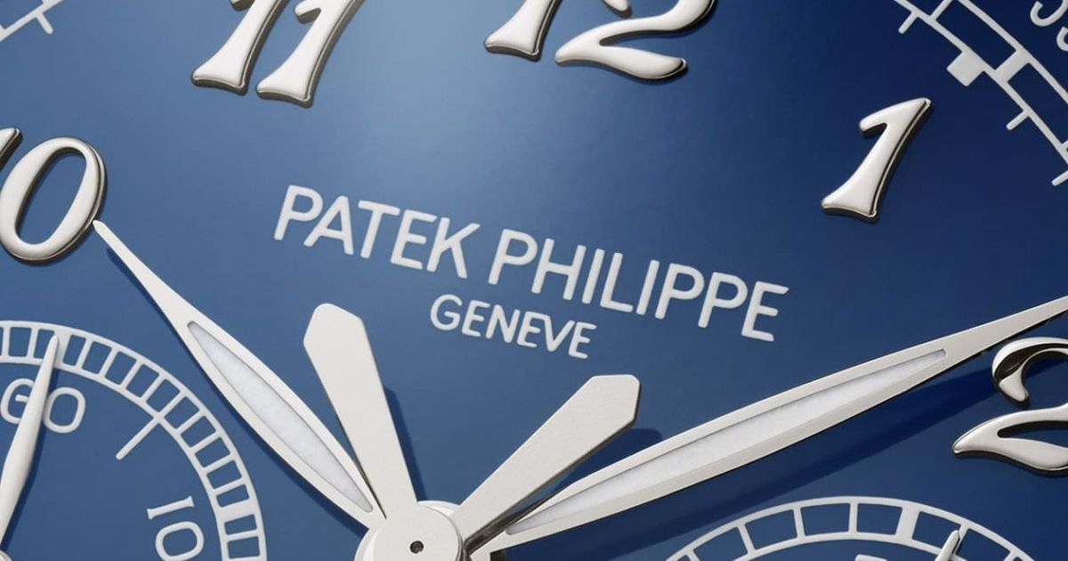
Often called the “base” or “fond de cadran,” this is the very canvas itself. It can be crafted from brass, gold, silver, or even innovative materials like meteorite, aventurine glass, or carbon fibre. Its surface finish sets the stage: a sunburst pattern that plays with light, a classic matte, a granular grené finish, or an exquisite enamel coating. This foundational choice dictates the entire mood of the watch.
The Main Actors: Hands & Indices
Hands:
These are the moving pointers that tell the tale of time. Their shape and style have names steeped in history:
- Feuille (Leaf): Elegant and tapered, a classic dress watch staple.
- Baton (Stick): Simple, modern, and clean.
- Alpha: A blend of leaf and dagger, often found on mid-century pieces.
- Dauphine: Faceted and beveled, designed to catch the light with a sharp, luxurious glint.
- Skeleton: Where the metal is cut away, leaving only an outline, revealing artistry and reducing weight.
- Luminous: Often filled with Super-LumiNova, providing functionality for low-light reading.
Indices (or Hour Markers):
These mark the hours. They can be:
- Applied: Individually crafted and attached to the dial, creating depth and shadow. This is a sign of higher craftsmanship.
- Printed: Painted directly onto the dial, often for a more utilitarian or vintage feel.
- Roman Numerals (e.g., I, II, III, IV): Traditional and elegant.
- Arabic Numerals (e.g., 12, 3, 6, 9): Sporty and legible.
- Baton/Stick Markers: Minimalist and contemporary.
- Diamond Indexes: For pure luxury and brilliance.
The Functional Elements
The Signature & Text:
The brand’s logo (often called the “signature”) and additional text (like the model name, technology badges, or “Swiss Made”) are often printed or applied with meticulous precision. The font and placement are crucial to the dial’s balance.
Sub-dials (or Counters/Registers):
These are smaller dials recessed into the main dial, indicating additional complications. On a chronograph (stopwatch), they typically track elapsed minutes and hours. On a triple-calendar, they might show the day and month.
Date Window:
One of the most common complications. It can be a simple aperture at 3 o’clock, a window framed in metal, or a magnifying “cyclops” lens over the date for enhanced readability. More complex versions include the “big date” (or Grande Date), which uses two separate discs for a large, clear display.
Small Seconds:
A separate sub-dial, usually at 6 o’clock, for the seconds hand, as opposed to a central seconds hand. This creates visual harmony and is a hallmark of many manual-wind movements.
Power Reserve Indicator:
Often a curved gauge or sub-dial showing how much energy (in hours or days) remains in the mainspring before the watch needs winding. It’s a poetic and practical feature.
Minute Track/Chapter Ring:
The outermost ring, often with fine markings (seconds, minute increments, or tachymeter scales). It can be printed on the dial or on a separate, sometimes slightly raised, ring.
Special Features & Finishing Touches
Guilloché:
A mesmerizing decorative technique where intricate, repetitive patterns are mechanically engraved into the dial using a rose-engine lathe. The resulting waves, clous de Paris (hobnail), or sunray patterns create a breathtaking play of light.
Enamel:
The pinnacle of traditional dial art. Grand Feu enamel involves fusing powdered glass to the metal dial at extremely high temperatures, resulting in a deep, glossy, and incredibly durable surface that can last centuries. Techniques include opaque, translucent, flinqué (over guilloché), and cloisonné (with metal wire separators).
Lume (Luminescence):
A functional magic. Materials like Super-LumiNova are applied to hands and indices, charging in light and glowing in the dark. The colour (often green or blue) and evenness of application are details noted by enthusiasts.
Learning to “Read’ a Dial
Now that you know the parts, how do you appreciate the whole?
- Balance & Symmetry: Does the layout feel harmonious? Are the sub-dials balanced? Is the date window integrated or an afterthought? A well-designed dial should feel instinctively legible and aesthetically pleasing.
- Legibility: Above all, a watch must tell time. Can you read it instantly? The contrast between hands, indices, and the dial background is key.
- Depth & Texture: Look at the dial from an angle. Do applied indices cast subtle shadows? Does guilloché catch the light in three dimensions? This depth is a hallmark of quality.
- Character: A stark, matte black dial with baton markers speaks of minimalist tool-watch functionality. A white enamel dial with Roman numerals and feuille hands whispers classic elegance. A complex, layered dial with multiple sub-dials shouts technical prowess. What story does it tell?
Conclusion
The next time you look at a watch—whether in an article, a boutique window, or on your own wrist—take a moment. Let your eye wander across its face. Identify the dauphine hands, the applied baton indices, the subtle guilloché in the sub-dial. Appreciate the crisp printing of the text and the perfect curve of the date window frame.
Understanding dial anatomy transforms how you see watches. It moves you from simply telling time to reading a story of design intention, historical reference, and meticulous artistry. It is the essential first language in your journey as a watch lover.
Welcome to the beginning of a beautiful obsession.


